Tracking Usage

The Usage dashboard provides you with a useful visualization of your subscription's consumption information.

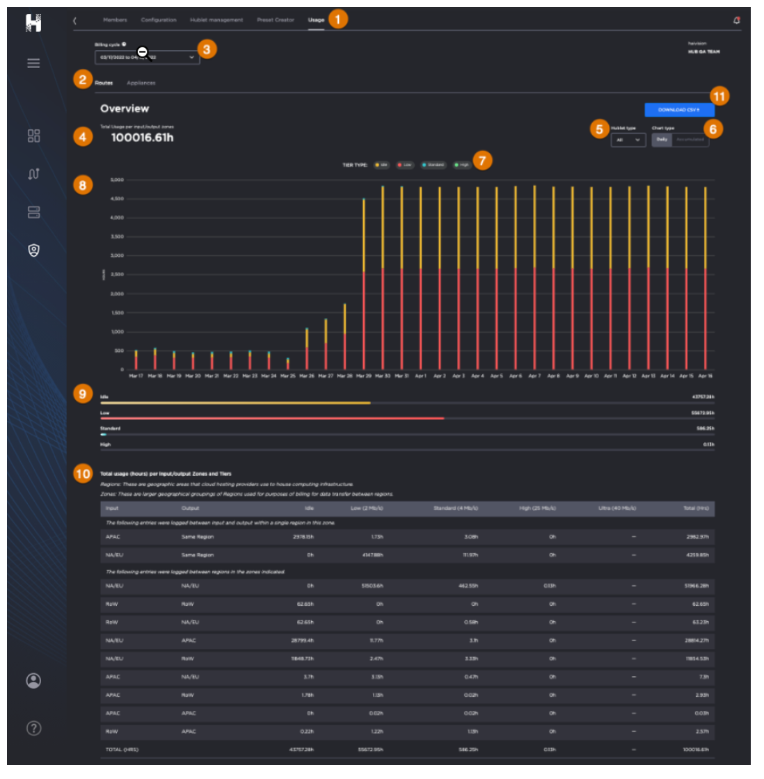
  • The top half of the pane summarizes the total hourly usage of the subscription and a chart displaying the hourly usage for each date of the selected cycle, organized by bandwidth tiers.
  • The bottom half of the pane contains a detailed usage breakdown by Zones and Tiers.

Tip

The following definitions are useful for understanding usage data:

  • Regions: Geographical areas that cloud hosting providers use to house computing infrastructure.
  • Zones:  Larger geographical groupings of Regions used for purposes of billing for data transfer between regions.
  • Tiers: A level or grouping of similar items to organize them. For example, bandwidth tiers, rate tiers, etc.
  • Total Usage: shows a sum of time usage reported by every processing and output Hublet in the route. For example, if a route has 1xRTT Hublet, and 2x output Hublets, and is set to run for 1 hour, the usage will be shown as 3 Hours: 1h (RTT Hublet) + 2h (output Hublets)
    Please note:
    • If an Agile Hublet , a Hublet that can be added to a running route, is added/removed; the usage time will not match the route time, as both agile Hublet and route would have had a different life cycle.
    • If there is no content streaming but the route is started, Idle time charges will apply.

Viewing the Usage Dashboard

To view the Usage Dashboard:

  1. Click
    Admin Area tab
  2. Select the desired Subscription.
  3. From the Admin Area section tabs, click the Usage tab
    .
  4. Choose between the sub-tabs
    to learn more about your
    • Routes – and usage of Hublets, tiers, and datacenter regions.
    • Appliances – the number of paired appliances available to your subscription.


Routes Usage


Filtering Data to Change Chart Visualization

To filter data and dynamically change the chart visualization: 

  1. Choose from the following options:
    • Click the Billing cycle drop-down 
       to select the date range you wish to view.
    • Click the Hublet type drop-down 
       to view usage for All or Regular Hublets.
    • Chart type 
       allows you to view Daily or Accumulated usage totals.
    • Total Usage per input/output zones
      shows the sum of time usage reported by every processing and output Hublet in the route.
    • Use Filter by bandwidth tiers
       to display usage data for the selected tier(s) only:
      • Idle – 0 Mb/s; ON but no streams.
      • Low – Up to 4 Mb/s streams.
      • Standard – Up to 12 Mb/s streams.
      • High – Up to 25 Mb/s streams.
      • Ultra – Greater than 25 Mb/s streams.
    • Usage Chart
       
    • Consumption Progress Bar
       
    • Usage Breakdown Table
       
  2. If desired, click the Download CSV button
     to generate a file containing consumption data for the selected billing cycle (date range).

Note

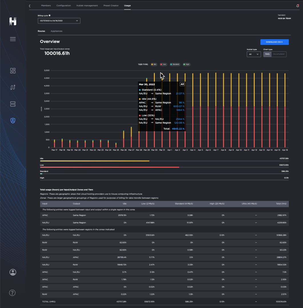
Hover your cursor over a bar in the chart to view the breakdown (tier, region, and usage) for a given day. 


Image of Routes Usage screen with cursor hovering over a chart, revealing a statistics panel.


Appliances Usage


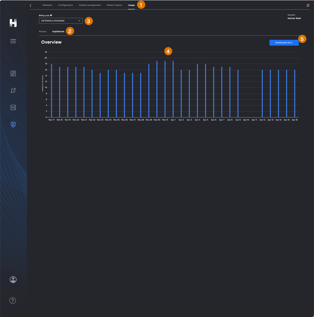
Labeled image of the Appliances Usage screen.

Usage Tab

Appliances Sub-Tab

  Billing Cycle (Date Range)

Number of Paired Appliances by Date

Download CSV Button


Viewing Paired Appliances

To view paired appliances:

  1. In the Admin Area, click the Usage tab
    .
  2. Click the Appliances sub-tab
    .
  3. Use the Billing Cycle dropdown menu to specify the date range in which you are interested.

Note

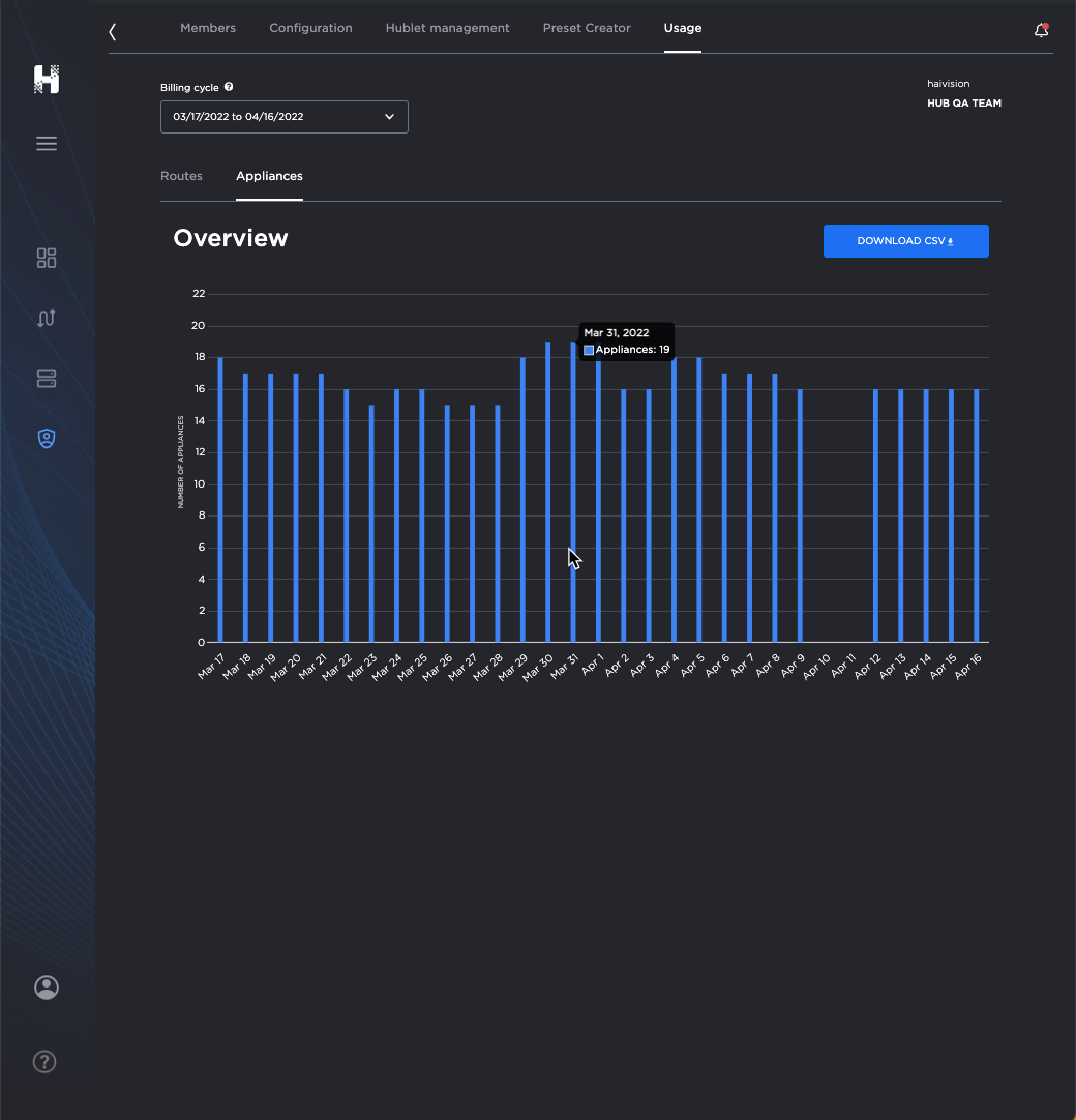
Hover your cursor over a bar in the chart to view the number of appliances paired for a given day. 


Image of Appliances Usage screen with cursor hovering over a chart, revealing a statistics panel.


JavaScript errors detected

Please note, these errors can depend on your browser setup.

If this problem persists, please contact our support.